Turn a Table Into the Numbers and Charts People Check
Summarise a table as a number, a progress bar, an aggregate table or a chart, and keep it beside the records it came from.
The number everyone asks for on Monday should not take a spreadsheet and half an hour.
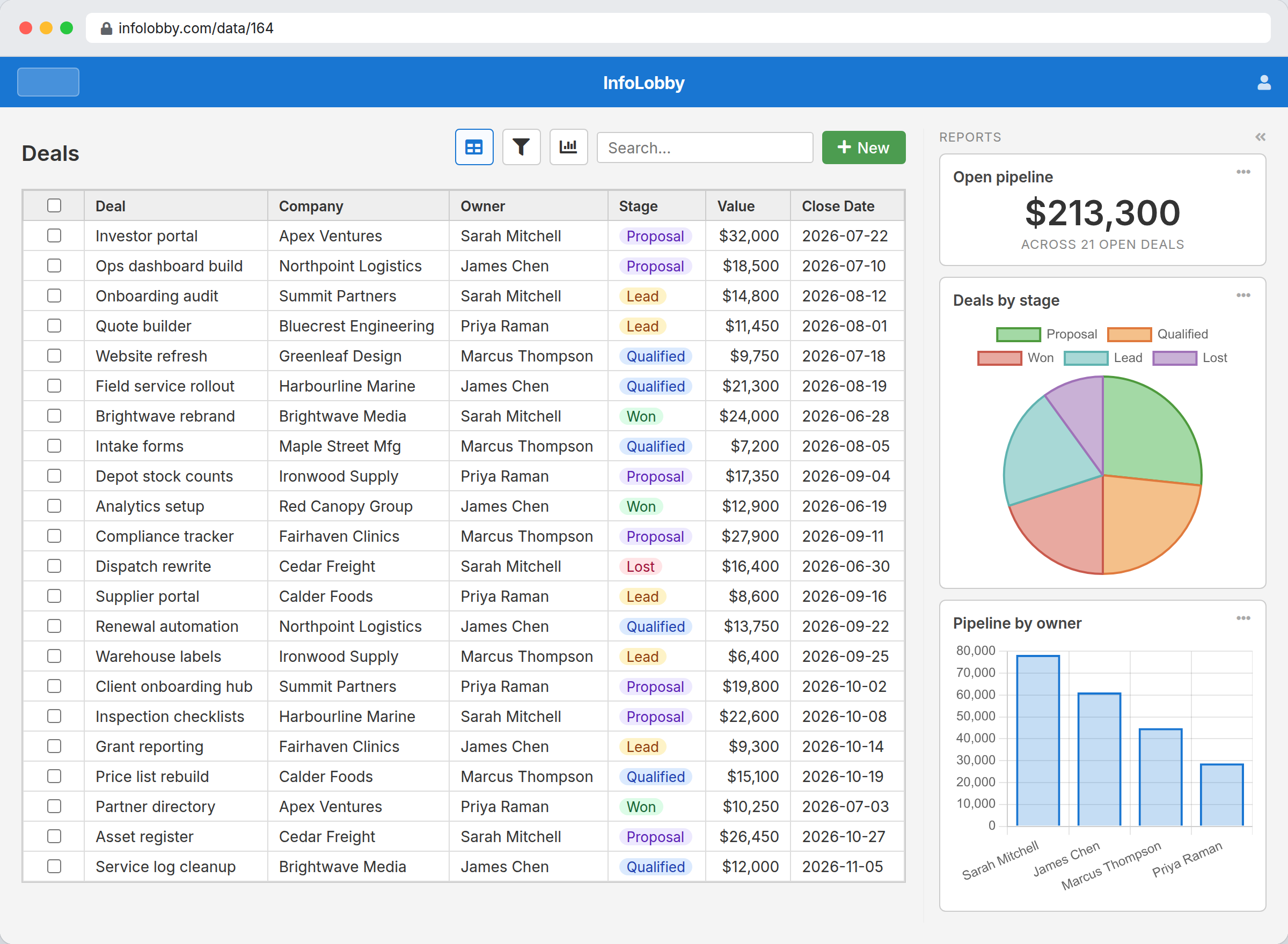
The number and the records should not live in different places
Somebody asks what the open pipeline is, how many requests are still unassigned, or how many hours the retainer has left. The data is already in the table. Getting the number out of it usually means an export, a pivot, and a figure pasted into a slide that is wrong by Thursday.
A report is that question saved against the table. Open the table and the answer is in the rail beside the records, calculated from the rows you are looking at. When a record changes, the tile changes with it, because there is no second copy of the data for it to drift from.
A report is a saved question, not another copy of the data.
Nothing is duplicated and nothing is scheduled. The tile runs its aggregate against the table when someone opens it, under that person's permissions, so two people looking at the same rail see numbers drawn from the records each of them is allowed to read.
- Put the question where the work is, on the table's own rail
- Use a progress bar when there is a target, and a chart when there is a shape
- Let each person pin the handful of numbers they actually watch
What a report can show
- Count, sum, average, minimum or maximum over any field on the table
- Group by a field to get a vertical bar, horizontal bar, line, area or pie chart
- Show one big number with a prefix, a suffix and the decimals you choose
- Set a target and two thresholds so a progress bar reads red, orange or green
- Filter down to the records that count, including rolling dates like the last 30 days
- Report on a related table, so an invoice can total the line items underneath it
- Write a markdown tile for the notes, links or instructions that belong beside the data
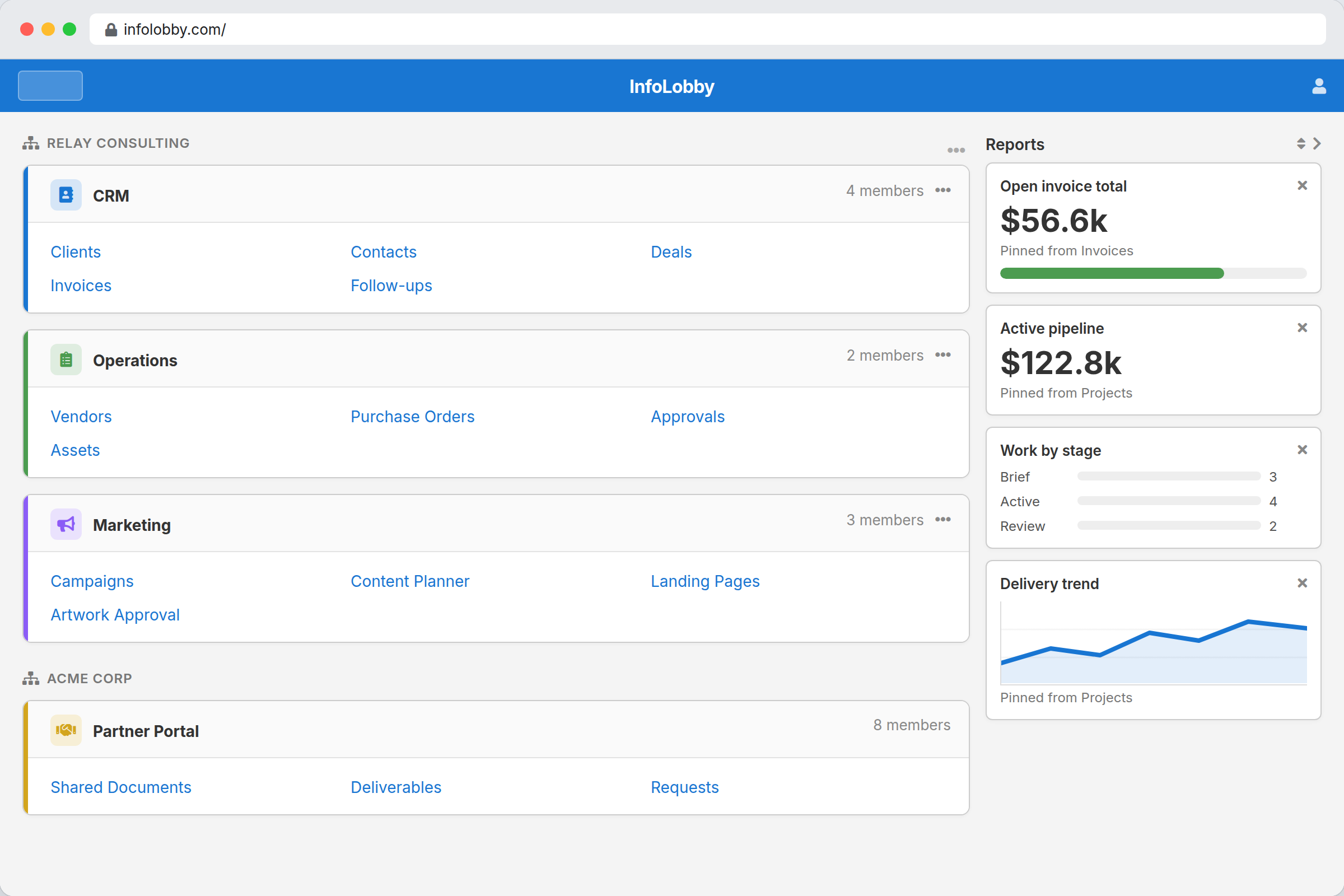
The numbers you watch, on your own home page
A report belongs to the table it was built on, but nobody wants to open four tables to read four numbers. Copy a tile to your home page and it sits with the rest of your workspaces, still reading its source table, still respecting your permissions. Your home rail is yours: what you pin, and the order you put it in, changes nothing for anyone else.
Building your first report
- Open the table's settings, go to the Reports tab, and pick a type. The editor previews the tile against your real records while you change it.
- Choose what to aggregate: count of open requests, sum of deal value, average days to close. Add filters to cut it down to the records you mean.
- Save it, and it appears on the table's rail for everyone who can open the table. Anyone can copy the ones they care about to their home page.
Where it fits
Use it for
- Operational numbers people check every week: pipeline, backlog, open requests, hours booked
- Teams who want the summary beside the records instead of in a separate reporting tool
- Workspaces where each person watches a different handful of numbers
Reach for something else when
- Dashboards that join several unrelated tables into one view
- Warehouse-scale BI with pivot tables and ad-hoc drilldown
- Scheduled PDF report packs. A report is a live tile, not a document that gets posted out
Questions people ask
Who can create a report?
Table admins create and edit them in the table's settings. Everyone who can open the table sees the rail, and any member can copy a report to their own home page.
Which chart types are available?
Vertical bar, horizontal bar, line, area and pie, plus a single value, a progress bar, an aggregate table, and a markdown tile for text.
How current are the numbers?
They are calculated from the table when the tile loads. Results are cached for about half a minute, so a busy page does not re-run the same aggregate for every viewer, and the cache is per timezone so a rolling date filter means the same thing to everyone.
Can a report summarise a different table?
Yes, one lookup away in the same workspace. An invoice's rail can total the line items underneath it, and a child table's page can show a figure from its parent. It is a single aggregate across that table, not a number per displayed record.
Can I filter a report by a rolling date?
Yes. A date filter can hold a token such as today, start of month, or minus 30 days, and it is resolved every time the report runs, in the viewer's timezone. You never have to go back and edit the date.
Try it on your own data
Start free and build one working process around this feature, then add the records, views, tasks and automations around it.